Two-Tone Kitchens in Beverly Homes
On painted islands, mixed lowers, and the art of making two colors feel like one intention
The two-tone kitchen has moved well past trend status. At this point, it's simply good design — a way of adding depth, breaking up visual monotony, and giving a kitchen a sense of composition that an all-one-color approach rarely achieves.
Searches for "painted kitchen island" are up nearly 100% year over year, and it's easy to understand why. The painted island — a darker or more saturated color on the island, lighter on the perimeter — is the most accessible entry point into the two-tone kitchen. It requires a single additional decision and produces an outsized result.
But there are several ways to do it, and some work considerably better than others.
The Most Common Approaches
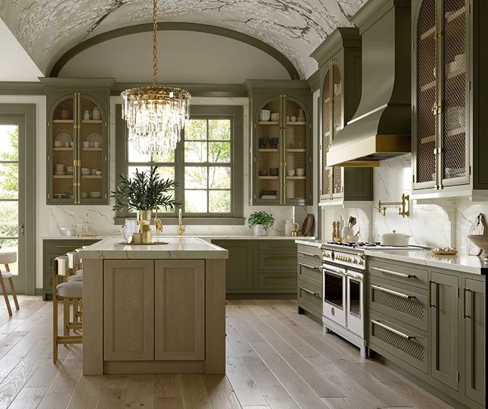
Upper and lower split. The most traditional form of the two-tone kitchen: painted or stained lowers, white or off-white uppers. This is the version that's been around longest and ages most reliably. The lowers carry the color story; the uppers keep things from feeling heavy. It works particularly well in kitchens with lower ceilings, where all-dark cabinets can feel oppressive.
The painted island. Stand-alone island in a contrasting color to the perimeter cabinets. This is the most popular current interpretation, and the most flexible — the island can be resprayed or replaced more easily than perimeter cabinetry, making it a lower-commitment way to introduce color. Colors that work consistently well for islands include deep green, navy, dusty blue, and warm charcoal.
Accent run. A single run of lower cabinets — say, along the back wall under open shelving — treated differently from the rest of the kitchen. This is a subtler interpretation that creates visual interest without committing the whole room.
Color Combinations That Hold Up
The two-tone kitchens that look best ten years on almost always share one characteristic: the two colors are genuinely related. They come from the same tonal family, or they create a contrast that is deliberate rather than accidental.
Some pairings that work particularly well:
Off-white uppers, sage green lowers. The combination that has defined the aspirational kitchen of the last few years, and for good reason. The warmth of the off-white and the organic quality of the sage sit in easy conversation.
Warm white perimeter, deep navy or forest green island. A stronger contrast that reads as more urban and contemporary. Works especially well in open-plan kitchens where the island is a natural focal point.
Painted lower cabinets, white oak uppers. An interesting inversion of the usual approach — the wood tone sits above, the color below. Creates a grounded, layered quality.
Two neutrals, different values. Not all two-tone kitchens involve a color. A soft white upper against a warm putty, mushroom, or greige lower is a quieter version that still provides depth and interest.
What to Avoid
Colors that compete. Two saturated, high-contrast colors fighting for attention produce a kitchen that feels busy rather than composed. If you're using a bold color for the island or lowers, the other element should be calm enough to let it read.
Mismatched undertones. This is where many two-tone kitchens go wrong without anyone quite knowing why. If your white upper has a cool, blue undertone and your lower is a warm greige, they'll clash in a way that's hard to articulate but impossible to ignore. Test your colors in the actual room, in the actual light, before you commit.
Hardware that doesn't bridge the two tones. Hardware is the detail that ties a two-tone kitchen together. When it works, it reads as a conscious thread running through the room. Unlacquered brass tends to bridge warm combinations beautifully; matte black works well in cooler, more contemporary kitchens.
Two-Tone Kitchens in Beverly Homes
The two-tone approach is particularly well-suited to the kinds of kitchens found in Beverly's older homes — rooms that often have strong architectural bones but irregular layouts, lower ceilings, or smaller footprints. Breaking the space into two color zones creates a sense of considered design that an undifferentiated approach doesn't achieve.
It's also a useful strategy in galley kitchens, which are common in Chicago bungalows and two-flats. Painting the lowers in a deeper color grounds the room; keeping the uppers light maintains the sense of airiness.
Beverly Cabinets can help you work through the combination that's right for your specific room — light conditions, ceiling height, existing finishes, and personal preference all factor into what will actually work.